The
Badtime Bedtime Storybooks were pull-out mini-books inside
Britain's Monster Fun comic in 1975-1976. There's never been anything
like them. They were about us, the kids who read them: that was me in
that picture, I was an "under the bedclothes reader" along with other 6
to 10 year old kids up and down the land. Each badtime book was
inspired by a classic of literature or 1970s culture. They introduced a
new world each week to impressionable little kids, kids who could now
read a whole "book" for the first time in their lives!
"Never heard of them. What are they again?"
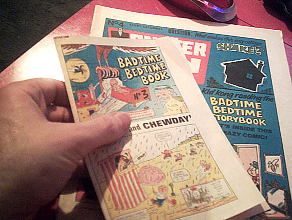
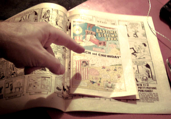
The Badtime books were the middle four pages of
Britain’s weekly Monster Fun comic (1975 - 1976). The center pages
could be pulled out and folded over to make an eight page “book,” and
each was a parody based on a classic novel or TV series. As the name
suggests they were designed to be read under the bed clothes by little
kids like me. To a six or seven year old kid like me, an eight page
mini comic was a real book!
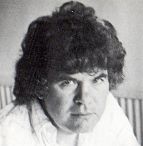
Who is Leo Baxendale?
The classic Badtime books were the last mainstream comics work from Leo
Baxendale, immortal British comics creator, inventor of the Bash Street
Kids and numerous other timeless classics. Visit Peter Gray's
site for examples.
Baxendale is still at work creating comics, but this was his farewell
to the regular weekly papers that used to be the heart and soul of
British comicdom. And what a high point to end on! Part of the reason
why he left mainstream comics was that he felt betrayed by having
people reprint his old stuff without him seeing a penny in royalties.
So I feel a little bit guilty in making the web site (but the
alternative is to have his best work completely forgotten, and that
would be a bigger crime). So please, readers, visit Baxendale's web site
and buy something so I feel less guilty. There's some seriously good
stuff there: www.reaper.co.uk
How the Badtime books began
Baxendale was arguably the number one British
comics artist at the start of the 1970s, and was under pressure to
create more and more work each week. Then in 1973 the British economy
took a downturn and there was less work to be had. Baxendale took this
review his career. He didn’t like producing rushed work, and wanted to
spend more time on each strip, to create higher quality work, so this
was a good time to change gear.
With less work, he could spend more time on each page, and the readers
and editors loved it. In February 1975 he was approached by his editor
about a new comic to be launched in the spring, called Monster Fun.
They planned to give him the middle four pages to do with as he wished.
Back in those days, comics were in black and white except for the
covers and center pages, and the middle four pages were sometimes
reserved for posters, so to have the middle four pages was quite the
opportunity. Also, comic creators had much less power over their
strips, so to be given complete freedom was something special. The
editor suggested the title Badtime book and left the rest up to
Baxendale.
At the time, Baxendale was drawing three other
weekly strips: Sweeney Toddler, Clever Dick, and Snooper. Individual
characters were always easier to draw than comics featuring a whole new
multiple cast each week, but even so he needed to drop the other titles
in order to focus his energies on the Badtime book. the other editors
of course were heartbroken to see their favorite artist leaving their
most popular strips, but I think history shows he did the right thing.
He broke the news gently, and didn’t just drop all three at once, as
this would have caused bad feeling that could jeopardize the badtime
book work.
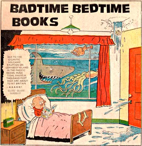
The scans below are the end of chapter 11 and the start of chapter 12
of Baxendale's autobiography, "A Very Funny Business."
A note about the lettering
I’ve been looking through some of my old
Badtime books and noticed something. At first glance they look ugly!
The writing and pictures are often small and there's lots of empty
space. So they can look poorly designed and empty (at first glance).
Well it's true that some of them were rushed out and there wasn't time
to do them properly. But mostly it's because of THE LETTERING.
The earlier classic Badtime books presented unique challenges to
letterers. First, there’s much more detail than on regular pages.
Second, the books are printed sideways. Third, the panel shapes and
positions aren't standardized. I don't know much about lettering in the
1970s, but I bet it wasn't highly paid so the letterer had to rush to
make any money. And I bet they didn't get paid extra for hard jobs like
the Badtime books. So what was a poor letterer to do? Answer: just
print everything very small. That way you don't have to worry about
complicated layouts. When the artist says "put this text here" you
print it very small in exactly that place. Job done. Onto the next page.
The result is a little weird. The artist leaves big gaps for the
lettering, then the lettering itself is tiny, and requires incredible
eyesight to read the finest print. And in order to maintain some kind
of legibility, the letterer has chosen the most unappealing plain and
serif font imaginable. Baxendale noted that around this time the comics
were experimenting with mechanical lettering, so maybe that's the
answer - they'd never done it that way before? I don't know the answer,
but the lettering is a real shame. If these things were ever
re-released I hope someone re letters them using a computer, to get
closer to the original vision of the writer/artist.
To see how the lettering
should be done, check out Bo Creep.
How Baxendale left the Badtime books
Baxendale wanted to create his best work all
the time, but the weekly pressure of mainstream comics meant he always
had to make compromises or miss deadlines. Plus he was becoming
disillusioned with the industry, since it was always reprinting his old
work but he never saw a penny in royalties. His dream was to spend a
whole year making just one comic and selling it himself. But who would
publish it? At that time he read an article in the Guardian about Colin
Haycraft, the new manager at publishers Gerald Duckworth. here was a
man who really understood comics. So Baxendale sent some copies of the
Badtime books to Haycraft
Rather than produce second rate work (Monster Fun comic came out
weekly, but a good Badtime book took ten days to make) Baxendale left
some of the stories to others. Those other Badtime books were good, but
not as great as his classics. It became a real headache for the
editors, since nobody else could do what Baxendale did. Readers noticed
that the quality was becoming patchy..
At this time, Baxendale was becoming more aware of the fan and
independent comics world, a world where artists could live as human
beings and not as machines crushed by deadlines who lost control of
their work the moment it was mailed. He began to see a life beyond the
rat race.
For all his working career, Baxendale had been working long hours under
great pressure. He was a fan favorite, and everyone loved his work, but
it was “work for hire” and he never got rich, and he never saw a penny
in royalties. In October 1975, Duckworths signed a contract to publish
Willy the Kid, and Baxendale would retain ownership of his work. the
contract paid him in advance for a complete annual that had to be
completed by the following May. As a freelance it was a simple matter
to resign from IPC magazines (the publisher of Monster Fun) and work
full time on Willy the Kid.
From that moment it was only a matter of time before the Badtime books
and Monster Fun folded. There was normally a six week delay between
finished art and the comic coping on sale, so the Baxendale Badtime
books run ended in December 1975. Other artists and writers did their
best in the next months, but readers noticed the decline in quality,
and sales of Monster Fun declined. In those days, if an IPC comic
lasted a year then it broke even, financially. And two years was a
great success. Monster Fun lasted 18 months, and finally merged with
Buster in October 1976. There were a few more annuals, and that was it.
Other artists
Baxendale wrote and drew the first seven Badtime books, and in total
drew 21 before he left. Most of the others were drawn by Mike Brown.
Jack Clayton also drew a couple and there were one or two by Terry Bave
and Artie Jackson. I don't have much more information on the other
artists (hence the emphasis on Baxendale) but if I learn more I'll post
it here.
Reprints?
The badtime book canon has never been reprinted
in any regular fashion, though individual issues occasionally surfaced
in Buster (in the example on the left the stories are recolored and the
prefix "Buster's..." is added to the title), or in reprint comics like
“Funny Fortnightly.”
Their popularity among fans was unprecedented (they were the first IPC
kids strip to generate adult fan mail) so why weren’t they reprinted
more often? I think there are several reasons.
The collectors market
The badtime books were designed to be removed from the comic, and so
they are missing from the vast majority of old Monster Fun comics. For
example, at time of writing (late May 2007) there are four Monster Fun
Comic auctions on eBay. The largest of these has 68 different issues -
almost the entire set. Another has 13 issues, and the other two are for
single issues (issue 1 and the Christmas issue). Guess how many badtime
books are included in those auctions. Give up? One. Just one single
badtime book survived out of more than 80 issues. Those things are like
gold! Which is one reason why I made these web pages.
Baxendale in the 1970s,
and today


Can you help? I'm hoping
to add just the first page of every badtime book to this site. If you
have a Badtime book that isn't represented here, and you have access to
a scanner, or you know any Badtime related information, my address is
Thanks!
All comic art copyright IPC magazines (1970s)
and Egmont International (today).
Thanks to Irmantas,
Muffy, the Hornet, Toonhound,
Peter
Gray, John Pollock, and Andy & Sharon Laney-Davis for
most of the scans. Thanks to Kashgar, Lew Stringer, Bustercomic,
philcom55 and SteveZodiac of comicsuk.co.uk
for general help and information. And of course thanks to Leo Baxendale
and all the writers, artists and editors who created these gems in the
first place!

First, they were pullout pages designed for the
color center spread, a part of a comic that was seldom available for
reprints. And they didn’t work as well in back and white.
Second, they were so memorable that readers would immediately notice
that they were reprints. Britain, until recently, had no tradition of
openly reprinting classics. And the lettering style, the frame style,
everything draws attention to itself as being something very different.
It just doesn’t fit in anywhere except as a centerpiece. But the whole
point of a reprint is to fill up space in a generic way.
Third, the lettering style, as noted, can detract from the story. Any
editor who was unfamiliar with the Badtime books would glance at them
and think “nothing special, but hard to reprint.”
Fourth, the editorials by Leonard Rottingsocks assumed a familiarity
with readers and referred to Monster Fun and the letters page, so that
entire section would need to be redrawn or rewritten.
Fifth, the pages are printed sideways, and need to be removed from the
comic, cut out and reassembled to make sense. In a regular comic
readers can get used to this, but as an occasional reprint it can be
confusing. This is a serious matter when the entire British humor comic
industry was in decline and readers just didn’t care for them any more.
By the 1990s the classic stories were largely published in reprint
anthologies like “Funny Fortnightly.” Casual readers just didn’t have
the dedication that these strips demanded. And neither did the editors,
apparently. I have a “Funny Fortnightly” hardback annual where even the
title is misspelled.
Finally, all great comedy is largely of its time. The Badtime books
were full of 1960s and 1970s style humor and references to 1960s and
1970s pop culture. new readers just wouldn’t find them as funny.
(Except very cultured and intelligent readers like YOU, of course.)
I have often thought that the Badtime books, with their small page
size, would be perfect for a paperbacked anthology, where the entire
run could be published as a single book. Personally I would buy at
least ten copies. But until then, this web site (and buying Monster Fun
comics on eBay) is the best we can do.

Leonard Rottingsocks
The one character who appeared in (nearly) every book was Leonard
Rottingsocks. Baxendale recalls:
Originally I called the 'editor' of
The Badtime Bedtime Books (can't remember whether he was the 'editor'
or the office boy acting as a commentator, but not to worry) Leonard
Rottingcorpse, but Bob Paynter, the editor of Monster Fun Comic,
changed the name to Rottingsocks on grounds of good taste.
Sigh.....

Every week introduced a
new world, a new cast, and gave a complete story. Plus some closing
words from the editor, Leonard Rottingsocks. He made the world of comic
publishing come alive (in a crazy way of course) and invited the
readers to write in. This just added to the pseudo realism, the sense
of familiarity, and the general fun.
I loved the idea of escaping under the bedclothes into a crazy new
world in a new book every week. It just worked on so many levels.
Most weeks, Rottingsocks would ask readers to
send in letters. Some of them were printed in issue 12 (because of the
printing time lag, these referred only to issues 1 to 6). Click on the
image for a giant size view.
A note about scan quality
The scans are in JPEG format, and most are
kindly donated by visitors to this site. Obviously the quality depends
on the condition of the original comic, the scanner and settings used,
etc. Remember that the original badtime books are much smaller than the
size you see on the screen. And the original comics were never designed
for that kind of detail. In particular, the colors were sometimes
printed a few millimeters off, and the dot patterns were relatively
large so the tiniest text is sometimes very hard to read even on the
original.
Anyhow, 'trevortoons' has kindly tidied up one of the scans so you can
see the difference. he's chosen a later one, in black and white,
because the earlier scans (in color, with the tiniest details) would
probably be impossible to fix. Click on the images to the left to see
the original scan from a page and the same scan, cleaned up.
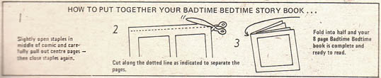
IMPORTANT NOTE ABOUT SIZE
The badtime books were SMALL, but the scans on this site are BIG. This
can be misleading. As full size pages they may look like nothing
special. But as tiny books, hidden in ordinary comics, they were
magical.
Try to imagine the excitement you'd feel as a six or ten year old when
you turn the page of a regular comic and find a tiny book bursting with
goodness. I remember that feeling. It was like a Tardis, or a doorway
to Narnia, a small thing that formed a gateway to another world.
The posters
These posters appeared in Monster Fun 29 (a
"Badtime Bedtime Book special" for the Christmas issue), and 59 and 61,
right near the end of Monster Fun's 73 issue run. The badtime books
presented the editors with an interesting challenge: they were the most
popular part of Monster Fun, but the hardest to exploit. They were
difficult to create (so they were missing from some issues) and did not
have any single star (except for Rottingsocks). And much of their
appeal came from their pull-out nature, something that would only work
with the middle four pages of a comic. It's hard to do with an annual,
or with any other number or position of pages. Anyhow, here are the
posters (click for a large version)


Before the badtime books
Monster Fun was not the first monster themed comic: Frankie Stein, the
'editor' of Monster Fun, was a regular star of 'Shiver and Shake'
comic, published until 1974 (the year before Monster Fun). In 1974,
Shiver and Shake experimented with 32 page mini-comics, like these two
examples -->
(Incidentally, the idea of a green non-human editor was used again, the
year after Monster Fun ended... in 2000AD!)
The Shiver and Shake pull-out comics were longer than badtime books,
and had a number of short stories, just like the regular comics. But
the Badtime books were different: each book had one complete story,
with a new set of characters, based on classic books. They had their
own clear identity.
When Monster Fun was first advertised, the Badtime books were a major
selling point: the ad on the right is from Whoopee comic, dated 7th
June 1975.
Above: for me, a key element of the
badtime books is the feeling of discovering a new fantasy world in
a small space. I got the same feeling from the wonderful
"Ticklish Allsorts" in Monster Fun and "World Wide Wierdies"
in Whoopee.


